Should Marketers Use Pop-Up Forms? A Comprehensive Analysis
As inbound marketers, we care about creating frictionless experiences for our website visitors that will also generate leads. Most of the time we can do both but in the case of pop-up forms, conflict does emerge.![]()
Over the past few years, pop-up forms have re-emerged as a popular marketing tactic for promoting content, driving blog subscriptions, growing email lists, and fueling lead generation. The question is, do pop-up form work? We’ll cover that and more below.
What is a pop-up form?
A pop-up form is a window that appears while a user browses a website. It can be triggered by a number of actions, including interactions with an element on the page, scrolling, and inactivity.
Pop-ups have become so prevalent that back in 2016, Google weighed in to announce it would start penalizing websites using, what they call, “intrusive interstitials.”
But here’s the thing: not all pop-ups are bad. When executed well, they can be part of a healthy inbound strategy.
However, because of the intrusive and disruptive nature of pop-ups, marketers should be careful of when and how they appear as well as the type of content they present. In other words, context.
When they’re appropriate context mixed in with added value, pop-up forms can enhance website visitors’ experience and boost conversion rates.
Types of Pop-Ups
- Welcome Mats
- Overlay Modals
- On-Click Pop-Ups
- Gamified Coupons
- Top Banners
- Slide-In Boxes
Pop-ups come in many shapes and sizes, but here’s a graphic that depicts the most common ones you might see on a web page:
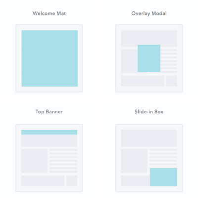
Let’s dive a little deeper into these pop-up formats:
1. Welcome Mats
These are full-screen pop-ups that slide above the page content.
The biggest advantage to using a welcome mat pop-up form is that ig brings the offer front and center. Consider doing this if the offer is highly relevant to your content and important to your strategy.
Otherwise, a welcome mat pop-up may be a little too intrusive, as it may not be what users expect when landing on this page.
2. Overlay Modals
As close to the traditional pop-up as you can get, these are center-screen pop-ups that appear on top of page content. 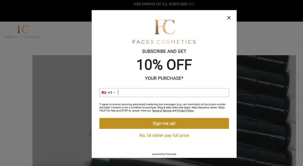
Unlike the welcome mat, overlays don’t block the rest of the content from being shown, but the user will have to click out of the pop-up to continue what they’re doing. While some users do feel that overlay modals are intrusive, they often have high conversion rates if the offer is compelling.
3. On-Click Pop-Ups
An on-click pop-up is a specific type of overlay modal that pops up with a form when a user clicks a call-to-action or other page element.
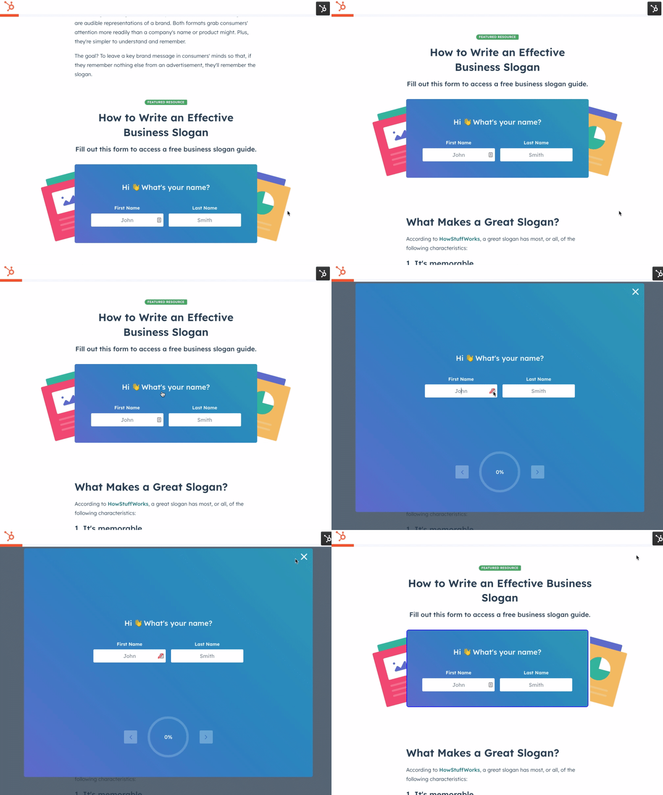
They’re perfect for when an in-line form would clutter the page but you want to decrease friction to a particular offer. The UX tends to be easy, which reduces friction on the conversion path.
4. Gamified Coupons
Another type of overlay modal, gamified coupons will let you play a game for a discount or prize of some kind in exchange for the users’ information.
They often come in the form of a prize wheel or scratch-off ticket and are best for fun ecommerce store brands (since the coupon can then be applied at checkout).
5. Top Banners
Also known as sticky bars, these are small banners that manifest as a bar at the very top of the page, asking the user to take action on something.

They are typically a more permanent conversion element than other types of pop-up and are best used for broad offers such as newsletter subscriptions, coupons, or even general announcements.
6. Slide-In Boxes
Slide-ins are small boxes that slide in from the side/bottom of the page, similar to an overlay modal but with less obtrusive behavior. 
These are great for presenting offers as the user is scrolling through the content of the page.
Pop-Up Triggers
Among the most popular pop-up triggers are:
- Page entrance: Pop-up appears when the visitor first gets to the page. These can be considered disruptive but can be used effectively with less-intrusive formats such as the top banner.
- Page scroll: Pop-up appears when the visitor scrolls to a certain point on the page. These are great for long-form content when you don’t want to embed CTAs in the content.
- Element interaction: Pop-up appears when the visitor clicks on or hovers over a specific element. These are highly effective since the user took a specific action with the intent to convert.
- Time on page: Pop-up appears when the visitor has been on the page for a specific amount of time.
- Exit intent: Exit intent pop-ups appear when the visitor scrolls towards the top of the page to leave. Consider it a last-ditch effort to capture their attention before they leave.
- Inactivity: Pop-up appears when the user has not taken action on the website in a while.
Now that we know a little more about pop-up forms, let’s get back to the core question: Should marketers be using them? Let’s dig in.
Do pop-up forms work?
I’ll answer this one right off the bat: The answer is yes. Pop-up forms do work, and this is the main reason so many marketers are using them.
In 2019, research conducted by Sumo found that the top performing 10% of pop-up forms convert at a whopping 9.3%.
In 2021, Klaviyo analyzed over 80,000 businesses using its software and found that overlay modal pop-up forms convert at 3.2% and slide-out pop-ups at 2.2%.
To dig into why some pop-up forms perform better than others, we surveyed 100 consumers to learn about their habits.
50% of respondents say what draws them most to a form is a clear indication of what they’ll receive for completing it. I.e. the offer.
The length of the form along with an engaging description will also play an important role in the conversion rate. In fact, 50% of respondents say a pop-up form’s length can cause them to abandon it.
The longer the form, the higher the odds they’ll disengage. 20% say they’ll abandon a form if they feel they’re asked invasive questions.
Although this can vary by form, it’s much easier for users to offer a name and an email than it is to give a phone number and home address.
Knowing which questions to ask is key to how well the pop-up form converts.
Find below additional tips on creating effective pop-up forms.
4 Tips for Crafting High-Converting Pop-Up Forms
1. Offer something relevant and valuable.
The problem with most pop-ups is they get in the way of the visitor’s experience on a website, rather than enhance it.
This is likely because the offer in the pop-up is either not valuable to the visitor or isn’t relevant.
To boost engagement with your pop-up, make sure you follow these steps:
- Understand your persona and what they’re expecting from this page.
- Know which offers will align best with their needs.
- Ensure the offer lines up with the content of the page
For example, if I were writing a blog post on social media, I would offer a free ebook on the same topic – as seen below. 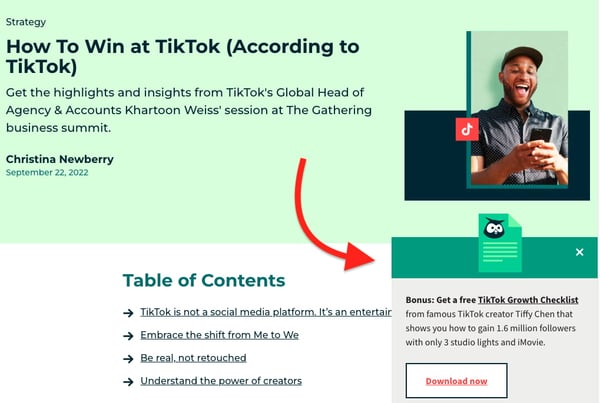
In this example, the article is all about growing an audience on TikTok as a brand. The pop-up offer aligns perfectly by offering readers a free TikTok growth checklist.
While an offer on social media statistics could work, the conversion rate would likely be much lower as it doesn’t directly target their current needs.
2. Think about the way people engage with your pages.
Another common mistake marketers make with pop-ups is having them appear at the wrong time, which adds to the annoyance factor. ‘
Be strategic about the timing and trigger of your pop-ups. Think about the way that visitors interact with certain types of pages on your site.
For instance, when someone engages with a blog post, they do so by scrolling down the page as they read the content. If you want to catch your visitors while they’re most engaged, then you should customize your pop-up to appear when someone has scrolled halfway down the page.
Similarly, you might find that people who stay on your product or pricing pages for more than 30 seconds are highly engaged because they’re taking the time to read through and consider their options.
In this scenario, you could use a time-based pop-up that appears when a visitor has been on the page for a specific number of seconds.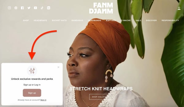
To better understand exactly how your visitors engage with different pages on your site, try looking into Google Analytics data, such as bounce rate and average time on page.
Better yet, use a tool like HotJar or Crazy Egg to record users on your site to build heat maps of where they click and scroll. This will give you a better sense of how people engage with your content.
In addition, consider the tool you’re using to build your form. A tool like Typeform will help you create branded and customizable forms that match your brand identity and will increase conversions.
3. Use language that’s specific, actionable, and human.
Most pop-up forms have a fairly basic layout. You get a headline, some body copy, and maybe an image. In other words, you don’t have a lot of real estate to work with.
This means it’s super important to nail the copy on your pop-up form. In order to do that make sure your copy is specific, actionable, and human:
- Specific: Specify exactly what a visitor is going to get if they click on your pop-up. Don’t tell them it’s a guide; tell them it’s a 10-page guide with actionable tips. Don’t encourage them to join your email list; ask if they want to stay updated on industry news and trends.
- Actionable: Let visitors know exactly what you’d like them to do. Instead of “Click Here,” try “Download our Free Guide,” or better yet, “Get my Free Guide.” Craft a compelling call-to-action that will inspire your visitors to take action.
- Human: Remind visitors that there’s a real person behind the pop-up form. Use colloquial language to make your forms friendly. Instead of “Join our email list,” try “Mind if we email you twice a week?”
4. Don’t ruin the mobile experience.
When building out your pop-up forms, it’s critical that you consider mobile. With most consumers accessing the internet from their smartphones nowadays, that could be a costly oversight.
To ensure a user-friendly mobile experience and avoid being penalized by Google, be sure to exclude your pop-up forms for mobile, or use pop-ups that don’t take up the entire screen of the page on mobile devices.
Most pop-up tools already offer this type of functionality, but if what you’re currently using doesn’t, you may need to find a new solution.
Editor’s note: This post was originally published in October 2016 and has been updated for comprehensiveness.


